


Courtesy of Niverville Nighthawks
The Niverville Nighthawks, the newest team to join the Manitoba Junior Hockey League (MJHL), have reached a major developmental milestone: the time has come to unveil their official logo.
Earlier this year, the team’s board of directors tasked board member Ray Dowse to take the lead on logo design. The timeframe was tight. The team settled on their name in late January, leaving them less than two months to make final decisions on their logo and colour scheme. The equipment order for pants, gloves, and helmets needed to be placed by March 15.
Being a community team, the Nighthawks tested out multiple colour schemes and logos to gather feedback from an informal public focus group of around 100 people. The board of directors used the information that was collected as part of its final decision-making process.
“I poured through different sports logos and pictures of birds or hawks online to provide our designers with ideas and try to determine the look and feel we were trying to capture for our team,” says Dowse. “We were really looking for something that would connect with both the players and community as a whole.”
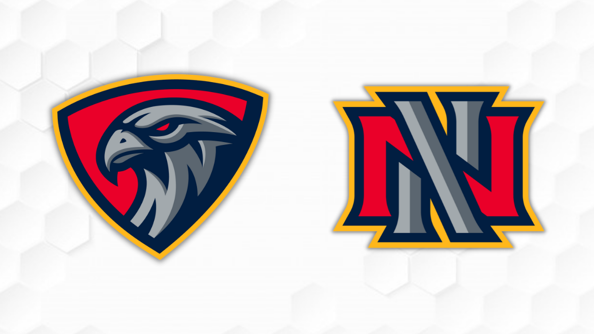
For the design, the team turned to Brooks Freeman Design out of Virden, which has an impressive history working with hockey logos and uniforms, including the Prince Albert Raiders, Brandon Wheat Kings, Virden Oil Capitals, and most recently Neepawa Titans rebrand.
“The team knew they wanted to do something very unique to not just the MJHL, but hockey in general,” says designer Brooks Freeman. “We tried a couple of versions with different shades of purples, greys, blues, and reds before settling on the navy, red, grey, and yellow. This bold colour scheme is sure to stand out, and I think it really helps the logos and jerseys become more appealing.”
Eventually they landed on a three-quarters view of a hawk head inside a shield. They also went through a few variations before settling on a secondary logo—an intercrossed double-N design that was inspired by a drawing made by Dowse’s son, Max.
Head coach and general manager Kelvin Cech is fully on board with the final design.
“I’m a bit biased, but I think it’s the best logo in the whole world. It represents us and our town very well,” says Cech. “All of a sudden, this feels very real. We have a name and a distinct look, as that hawk is very menacing and mean, very proud and bold. We’re stoked.”
For more information, please contact:
Ray Dowse, board member tasked with logo development: 204-346-3041
Clarence Braun, spokesperson for the board of directors: 204-791-2587
Kelvin Cech, head coach and general manager: 604-356-3394
")
")
")
")
")
")
")
")
")
")
")
")
")
")
")